
Fort Canine Swimming Club is Singapore’s newest pet destination, offering a unique blend of play, care, and delight under one roof. At the heart of the experience is the country’s largest indoor mineral pool for dogs, complemented by a suite of pet services. Its name is a playful nod to its location at Fort Canning.
Every Matter was commissioned to develop the club’s full brand identity covering the logo, brand visuals and spatial applications to reflect its vision of an inclusive “third space” for animals and their companions. Drawing inspiration from pool parties and street culture, the brand design balances lighthearted charm with a touch of sophistication, resulting in a lively visual universe that’s joyful, dynamic, and full of character.
Location
Singapore
Disciplines
branding, wayfinding
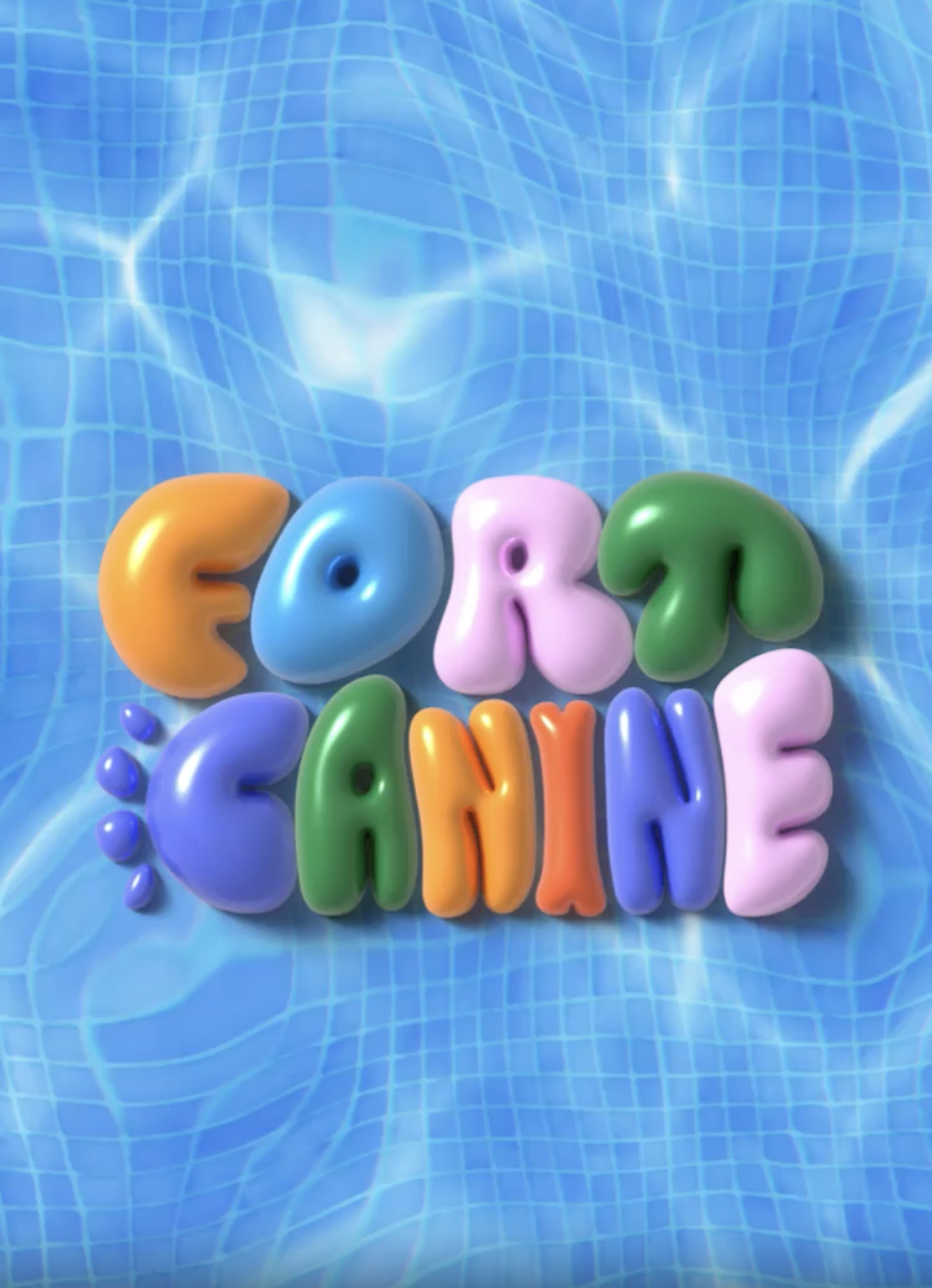
The custom logotype features bold, rounded typography reminiscent of paw prints and pool floats.
Mae Variable was selected as the secondary typeface to complement Fort Canine’s playful, rounded primary logotype. Its geometric, heavy sans-serif construction conveys strength and legibility, ensuring that functional information remain clear while providing the necessary balance of clarity and boldness across extended applications.

The brand’s vibrant, toy-like colour palette expressed through bold circular forms, evoking a sense of playful buoyancy—a quality reflected across the graphic elements.
Icons developed to support wayfinding applications.

The pre-opening hoarding design features custom stickers that hint at the club’s experiences, arranged in a scattered composition that captures a sense of casual energy and carefree fun.


Next project